the responsive navbar is the hero of any website. It’s the first thing users see, the compass that guides them, and often, the element that makes or breaks their experience. As a developer, you want it to be sleek, functional, and adaptable. As a user? You want it to just work whether you’re on a 27-inch monitor, a foldable phone, or browsing in a brightly lit room or a dark cinema hall.
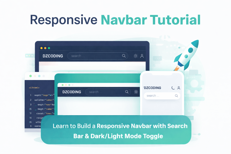
That’s why today, we’re going to build something special: a responsive navbar that packs a punch with a smart search bar and a dark/light mode toggle. We’ll be dissecting a real, working code example (the one you just saw) and optimizing it for both search engines and human beings.
By the end of this guide, you won’t just have a copy-paste navbar. You’ll understand why every line of CSS and JavaScript exists, and how to customize it to fit your own brand.
The Blueprint: What We’re Building
Before we dive into the code, let’s visualize the end goal. We are building a three-part navbar:
- Left Section (
.navLeft): Contains the brand logo “dzcoding”. This is your anchor. - Center Section (
.navCenter): The star of the show. A beautiful, rounded search bar with a search icon. On mobile, this section cleverly hides itself to save space. - Right Section (
.navRight): Houses a search icon (for mobile), a theme toggle button (moon/sun), and a user icon.
The magic happens in the interactions when you click the search icon on a small screen, the center search bar expands, taking over the navbar. Click the back arrow, and everything snaps back. Oh, and did we mention it remembers your dark mode preference? Let’s build it. a beautiful modern responsive navbar .
Part 1: The HTML Skeleton – Simple & Semantic
Our HTML is clean, using semantic classes that explain their purpose. There’s no convoluted nesting here. We use div containers strategically to create three distinct columns using Flexbox.
<div class="navbar">
  <div class="navContainer">
    <div class="navLeft">...</div>
    <div class="navCenter">...</div>
    <div class="navRight">...</div>
  </div>
</div>A subtle but powerful choice is the use of Boxicons for icons (bx bx-search, bx bx-moon). Using an icon font library like this keeps our SVG code clean and our file size small. It’s a win for performance and a win for SEO, as search engines value fast-loading pages.
Part 2: CSS Magic – Making It Responsive and Theme-Aware
This is where things get juicy. Let’s break down the two most impactful CSS strategies used here.
1. CSS Variables for Theming
Instead of hardcoding colors, we use CSS custom properties (variables). This makes switching between dark and light modes effortless.
:root {
    --bg-primary: #fff;
    --text-primary: #111827;
    --border-default: #E5E7EB;
}

.darkmode {
    --bg-primary: #0F172A;
    --text-primary: #F8FAFC;
    --border-default: #334155;
}By simply adding or removing the .darkmode class on the body tag, every element that uses var(--bg-primary) instantly changes color. This is infinitely more efficient than writing separate classes for every single element.
2. The Mobile-First Collapse
Modern users are on mobile. The media query @media (max-width: 600px) is where we optimize for smaller screens. Notice the clever trick:
@media (max-width: 600px) {
    .navbar .navRight .bx-search{
        display: block; /* Show search icon on right */
    }
    .navCenter {
        visibility: hidden; /* Hide the big search bar */
    }
}We hide the central search bar and reveal a search icon in the right section. This saves precious real estate. When you click that icon, JavaScript jumps in to change the visibility and display properties, giving the illusion of a brand new search interface popping up.
Part 3: JavaScript – Breathing Life into the UI
A static navbar is boring. We need interactivity. The JavaScript is divided into two core features.
Feature 1: The Expanding Search Bar (Mobile Hero)
When the user clicks the small search icon on mobile, we want the big search bar to appear and the logo/user icons to disappear temporarily.
searchBtn.addEventListener("click", function(){
     navCenter.style.visibility = "visible";
     navLeft.style.display = "none";
     navRight.style.display = "none";
     arrow.style.display = "inline";
});This is a classic “progressive disclosure” pattern. We aren’t deleting the logo; we’re just hiding it with display: none. The back arrow appears, allowing the user to reverse the action. This keeps the UI intuitive. An arrow means “go back” to most users.
Feature 2: Persistent Dark/Light Mode
This is the hallmark of a polished web app. Nobody wants to reset their theme every time they refresh a page. Here’s how we solve that using localStorage.
const EnableDarkMode = () => {
    document.body.classList.add("darkmode");
    localStorage.setItem("darkmode","enabled");
    sunIcon.style.display = "block";
    moonIcon.style.display = "none";
};When the user clicks the toggle, we:
- Add the
.darkmodeclass to the body (which triggers our CSS variables). - Save the preference
"enabled"in the browser’slocalStorage. - Swap the icons so the sun shows (indicating you can go back to light mode).
On page load, we check if localStorage has the darkmode key. If it does, we call EnableDarkMode() immediately. This prevents the “flash of incorrect theme” that plagues many poorly coded websites.
SEO & UX Considerations for Your Responsive Navbar
A beautiful Responsive navbar is great, but if Google can’t crawl it or users with disabilities can’t use it, you have a problem. Here is how our code addresses this:
1. Semantic HTML & aria-label
Notice the theme toggle:
<div class="themeToggle" id="themeToggle" aria-label="themeToggle">The aria-label is crucial for screen readers. A user relying on a screen reader will hear “theme toggle” instead of just “unlabeled button.” This improves accessibility and indirectly benefits SEO, as Google values user experience metrics.
2. The rem Strategy
While this code uses px for font sizes, consider converting to rem. Browsers allow users to set default font sizes. Using rem (e.g., font-size: 1.5rem;) respects those user settings, making your site more accessible.
3. Search Input Usability
The search input has a placeholder placeholder="search ...". This is good, but adding a label element visually hidden or using aria-label="Search query" would be even better for accessibility. Search is a primary navigation action; make sure assistive tech can find it.
Common Pitfalls and How to Fix Them
Even with solid code, things can go wrong. Here are two quick debugging tips:
- The “Flickering” Dark Mode: If you see the light mode flash before dark mode kicks in, move your JavaScript dark mode check from the bottom of the
bodyto the<head>(inline). This ensures the logic runs before the browser paints the screen. - Mobile Search Refuses to Hide: Check the CSS specificity. If your
visibility: visibleisn’t working, ensure no other class is forcingdisplay: flexon the.navCenterinside the media query. Use!importantsparingly; instead, refine your selectors.
Making It Your Own
This codebase is a responsive navbar template. Here is how you can extend it:
- Add Dropdowns: Transform the
navLeftornavRightinto dropdown menus for user accounts or categories. - Sticky Positioning: Add
position: sticky; top: 0; z-index: 1000;to the.navbarclass. This keeps the navigation bar permanently at the top as the user scrolls—a standard modern UX pattern. - Animate the Transition: Currently, the theme toggle snaps instantly. Add
transition: background-color 0.3s ease, color 0.2s ease;to thebodyand navbar elements for a silky smooth theme switch.
You might also like these :
How to Code a Modern Login Form from Scratch
How to Add a Popup Login Modal to Your Responsive Navbar
How to Create a Responsive Pricing Table
Mastering CSS Grid and Flexbox – When to Use Each
How CSS aspect-ratio Ends Layout Shifts for Good
Final Thoughts
Building a responsive navbar seems trivial, but mastering it separates a hobbyist from a professional. You’ve built a component that handles state (open/closed search), persistence (dark mode), and responsiveness (mobile/desktop) all in under 150 lines of CSS/JS.
The code you have is production-ready for a personal blog, a portfolio, or a startup dashboard. Keep iterating on it, test it on a real phone, and remember: The best navbar is the one the user doesn’t notice—because it just works.
Frequently Asked Questions (FAQs)
Q1: Why does the search bar disappear on mobile, and how do I make it stay visible?
A: The search bar hides on mobile due to the media query @media (max-width: 600px) { .navCenter { visibility: hidden; } }. If you always want it visible, simply remove that specific CSS rule or set visibility: visible inside the media query.
Q2: The dark mode setting resets when I close the browser. Why?
A: The code uses localStorage to save the preference. If it resets, check your browser’s privacy settings. If you are in “Private Browsing” or “Incognito Mode,” localStorage is cleared when the last tab closes. Under normal browsing, it should persist indefinitely.
Q3: How can I make the actual search function work?
A: Right now, the search bar is only a UI element. To make it functional, wrap the .searchBox in a <form> tag. Add an action="/search" and method="get". Give the input a name="q". When submitted, it will send the query to your backend or a search engine like Google Programmable Search.
Q4: Can I use Font Awesome icons instead of Boxicons?
A: Absolutely. Replace the Boxicon <link> with Font Awesome’s CDN. Then swap the classes: <i class="bx bx-search"></i> becomes <i class="fas fa-search"></i>. Just update the CSS selectors that target .bx to target the new icon classes.
Q5: The back arrow (bx-left-arrow-alt) doesn’t show up. What’s wrong?
A: Ensure the arrow’s CSS isn’t globally set to display: none outside the media query. In the provided CSS, it is hidden by default (.navbar .navCenter .bx-left-arrow-alt{ display: none; }). The JavaScript arrow.style.display = "inline"; only runs after the search button is clicked. Make sure your JavaScript variables are correctly selecting the arrow element.