If you’re learning web development, building a login form is one of those essential skills you need to master. It’s everywhere from social media platforms to banking apps, from small blogs to giant e-commerce sites.
But here’s the thing, many tutorials overcomplicate things. They throw Bootstrap, Tailwind, or heavy JavaScript at you before you even understand the basics.
Not this one.
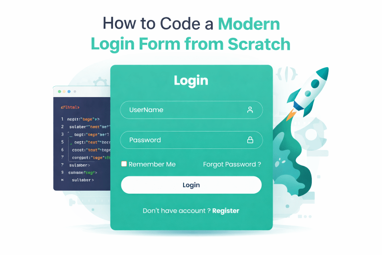
Today, I’m going to show you how to code a clean, modern, transparent login form using nothing but HTML and CSS. That’s it. No frameworks. No confusion. Just pure code that you write yourself.
And the best part? It looks professional enough to use in real projects.
Let’s get started.
Step 1: Setting Up Your Project Files
Before writing any code, create two files in a folder on your computer:
- index.html – this will hold the structure of your login form
- main.css – this will handle all the styling
Make sure both files are in the same folder. You can name them whatever you want, but sticking with index.html and main.css keeps things organized.
Open both files in your code editor – VS Code, Sublime Text, or even Notepad works fine.
Step 2: Writing the HTML Structure
Open your index.html file. We’ll start with the basic skeleton every HTML document needs.
Type this code:
<!DOCTYPE html>
<html lang="en">
<head>
    <meta charset="UTF-8">
    <meta name="viewport" content="width=device-width, initial-scale=1.0">
    <title>LoginForm</title>
    <link rel="stylesheet" href="https://cdn.jsdelivr.net/npm/feather-icons-css@1.2.0/css/feather.min.css">
    <link rel="stylesheet" href="main.css">
</head>
<body>

</body>
</html>Let me explain what’s happening here:
The DOCTYPE tells the browser this is an HTML5 document.
The meta viewport tag ensures your form looks good on mobile phones very important these days.
We’re linking two CSS files: one for Feather Icons (those nice little icons you see next to input fields)
and our own main.css file.
Now, inside the body tag, we’ll add the actual form.
<!DOCTYPE html>
<html lang="en">
<head>
    <meta charset="UTF-8">
    <meta name="viewport" content="width=device-width, initial-scale=1.0">
    <title>LoginForm</title>
    <link rel="stylesheet" href="https://cdn.jsdelivr.net/npm/feather-icons-css@1.2.0/css/feather.min.css">
    <link rel="stylesheet" href="main.css">
</head>
<body>
    <!--Form Start-->
    <div class="wrapper">
        <form action="">
            <h1>Login</h1>
            <div class="inputBox">
                <input type="text" name="" id="" placeholder="UserName" required>
                <i class="ft-user"></i>
            </div>
            <div class="inputBox">
                <input type="password" name="" id="" placeholder="Password" required>
                <i class="ft-lock"></i>
            </div>
            <div class="options">
                <label for=""><input type="checkbox" name="" id="">Remember Me</label>
                <a href="">Forgot Password ?</a>
            </div>
            <button type="submit" class="btn">Login</button>
            <div class="register">
                <p>Don't have account ? <a href="">Register</a></p>
            </div>
        </form>
    </div>
    <!--Form Ends-->
</body>
</html>Let me break down what each part does:
The wrapper div acts as a container , it’s the white (well, teal in our case) card that holds everything together.
The form element wraps all our inputs. Inside, we have a heading that says “Login”.
Each input field sits inside a div called inputBox. This helps us position the icon correctly. Notice the required attribute on both inputs that means the user can’t submit the form without filling them out.
The Feather icons (ft-user and ft-lock) will appear inside the input fields on the right side. Pretty neat, right?
Below the inputs, we have a row with a checkbox and a “Forgot Password” link. Then comes the login button, and finally a registration prompt for new users.
Save your index.html file.
Step 3: Styling with CSS – The Fun Part
Now open your main.css file. We’ll start by importing a nice font and resetting default browser styles.
Type this:
@import url('https://fonts.googleapis.com/css2?family=Lato:ital,wght@0,100;0,300;0,400;0,700;0,900;1,100;1,300;1,400;1,700;1,900&family=Poppins:ital,wght@0,100;0,200;0,300;0,400;0,500;0,600;0,700;0,800;0,900;1,100;1,200;1,300;1,400;1,500;1,600;1,700;1,800;1,900&display=swap');

*{
    margin: 0;
    padding: 0;
    box-sizing: border-box;
    font-family: "Poppins",sans-serif;
}The star selector targets every single element on the page.
We’re removing default margins and paddings because different browsers add different amounts.
The box-sizing: border-box makes sure padding doesn’t push elements wider than intended. And we’re using Poppins , a clean, modern font from Google Fonts.
Step 4: Centering the Form on Screen
Add this next:
body {
display: flex;
justify-content: center;
align-items: center;
min-height: 100vh;
background: #16a085;
}Here’s what’s happening:
display : flex turns on flexbox layout.
justify-content : center centers the form horizontally.
align-items : center centers it vertically.
The min-height : 100vh makes the body at least as tall as the entire viewport (visible screen area).
And background gives us that beautiful dark teal color.
Step 5: Styling the Form Card
Now style the wrapper (the white/teal card):
.wrapper {
background: #1abc9c;
width: 350px;
color: #fff;
padding: 15px;
border-radius: 10px;
}

.wrapper h1 {
text-align: center;
}We’re giving the form a lighter teal background, setting a fixed width of 350 pixels (perfect for most screens), white text color, some inner padding, and rounded corners. The heading is centered.
Step 6: Styling the Input Fields
This is where things get interesting. Add this:
.wrapper .inputBox {
display: flex;
align-items: center;
position: relative;
width: 100%;
height: 40px;
margin: 30px 0;
}

.inputBox input {
color: #fff;
background: transparent;
width: 100%;
height: 100%;
border: 1px solid #bdc3c7;
border-radius: 40px;
outline: none;
font-size: 16px;
padding: 20px 45px 20px 20px;
}

.inputBox input::placeholder {
color: #fff;
}Let me explain each line carefully:
Each inputBox is a flex container. The position: relative is important because we’ll position the icon absolutely inside it.
The inputs themselves have a transparent background (so you see the teal card behind them), a light gray border, and fully rounded corners (border-radius: 40px creates that pill shape).
Notice the padding: 20px 45px 20px 20px. That’s top padding 20px, right padding 45px (space for the icon), bottom padding 20px, left padding 20px. The placeholder text is white to match the theme.
Step 7: Positioning the Icons
Now add the icon positioning:
.inputBox i {
position: absolute;
right: 20px;
}This places each icon absolutely inside its inputBox container, 20 pixels from the right edge. That’s why the input fields have that extra right padding to prevent text from overlapping the icon.
Step 8: Styling the Options Row
Add this for the Remember Me and Forgot Password section:
.wrapper .options {
display: flex;
justify-content: space-between;
font-size: 15px;
margin: 20px 0 15px;
}

.options label input {
accent-color: #fff;
margin-right: 3px;
}

.options a {
color: #fff;
text-decoration: none;
}

.options a:hover {
text-decoration: underline;
}The flexbox with space-between pushes the checkbox to the left and the link to the right.
accent-color changes the checkbox color to white.
The link turns underlined when hovered a small detail that improves user experience.
Step 9: Styling the Login Button
Add this code:
.wrapper .btn {
width: 100%;
height: 40px;
border-radius: 40px;
border: none;
outline: none;
cursor: pointer;
font-weight: 600;
background: #fff;
color: #16a085;
transition: 0.3s;
}

.wrapper .btn:hover {
background: #ecf0f1;
transform: scale(0.98);
}The button takes the full width of the form. It’s white with teal text, and has fully rounded corners like the inputs. The hover effect adds a subtle color change and a tiny scale-down (98% of original size) this gives visual feedback that the button is clickable.
Step 10: Styling the Register Link
Last but not least:
.wrapper .register {
font-size: 15px;
text-align: center;
margin: 20px 0 15px;
}

.register p a {
color: #fff;
text-decoration: none;
font-weight: 600;
}

.register p a:hover {
text-decoration: underline;
}The register link is centered, bold, and white. It also underlines on hover.
Step 11: Testing Your Form
Save both files. Open index.html in your web browser ,just double-click it. You should see your login form centered on the screen with:
- Two input fields with user and lock icons
- White placeholder text inside transparent inputs
- A Remember Me checkbox
- A Forgot Password link
- A green login button that changes when hovered
- A register prompt at the bottom
Try typing into the fields. Try hovering over the button and links. Everything should work smoothly.
Step 12: Customizing the Form
Now that the basics are working, let me show you how to make it yours:
Change the colors: Look for #16a085 (dark teal) and #1abc9c (light teal) in the CSS. Replace them with your brand colors – maybe a dark blue and light blue, or purple and lavender.
Change the font: Replace “Poppins” in the font-family with any Google Font you like – “Inter”, “Montserrat”, “Open Sans” all work great.
Make it wider: Change width: 350px in .wrapper to 400px or 450px for a larger form.
Add a logo: Inside the form, above the h1 tag, add: <img src=”your-logo.png” alt=”Logo” style=”width: 80px; display: block; margin: 0 auto 10px;”>
Connect to a backend Currently the form doesn’t send data anywhere. To make it functional, add method=”POST” and action=”your-backend-file.php” to the form tag.
Common Problems and Fixes
Icons not showing up? Make sure you have an internet connection – the Feather Icons CDN needs to load. Also check that you’re using the correct class names (ft-user and ft-lock).
Form not centering vertically? Confirm that body has min-height: 100vh and that no parent elements are interfering with the flexbox layout.
Colors look different? The teal colors I used are #16a085 (darker) and #1abc9c (lighter). Feel free to experiment with color picker tools to find your perfect palette.
Input fields overlapping on mobile? The fixed width of 350 pixels works well on most phones, but you can add max-width: 90% to .wrapper to make it fluid.
What You Learned Today
Let’s quickly recap the skills you just built:
- Structuring an HTML document with proper meta tags
- Creating forms with different input types
- Positioning icons absolutely inside input fields
- Using flexbox to center content both horizontally and vertically
- Styling hover effects for better user experience
- Making forms responsive and mobile-friendly
- Customizing checkbox accent colors
These are real, practical skills that professional frontend developers use every single day.
Final Words
The best way to learn coding is by doing. You didn’t just copy and paste a finished product , you built it line by line, and now you understand exactly how each piece works.
That login form you just coded? It’s lightweight, loads fast, works on any device, and looks modern. That’s exactly what users expect today.
Save this code somewhere safe. Use it in your next project. Modify it, break it, fix it that’s how you become a better developer.
Happy coding!
Found this useful? Leave a comment below and let me know what you’d like to build next. I read every single one.