So you’ve built a beautiful responsive navbar. Maybe you’ve even added that sleek dark mode toggle we talked about
Build a Responsive Navbar with Search Bar & Dark/Light Mode Toggle
Your navigation works perfectly on desktop, tablet, and mobile. But something feels missing.
A login button.
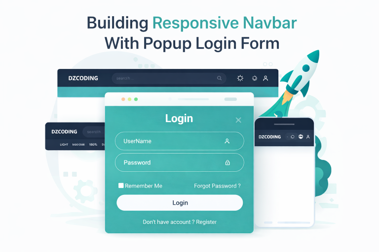
Not just any login button one that opens a clean, centered popup window without redirecting the user. That’s called a modal, and it’s one of the most user-friendly patterns for authentication.
In this tutorial, I’ll show you how to add a popup login modal to your existing responsive navbar. We’ll cover:
- The HTML structure for a modal
- Styling the modal to look polished in both light and dark themes
- JavaScript to open, close, and handle modal events
- Seamless integration with a Responsive Navbar with Search Bar & Dark/Light Mode Toggle
Let’s get started.
What Exactly Is a Popup Modal?
A modal is a dialog box that appears on top of your main page content. It “modals” the experience meaning users can’t interact with the background until they close the modal. This focuses their attention on the login form.
Think of it as a polite interruption. Instead of sending users to a separate login page (which can feel jarring), the modal keeps them on the same page. They log in, and they’re right back to browsing. No back button confusion. No lost scroll position.
Popular sites like Pinterest, Twitter, and Netflix all use modals for login. Why? Because they work.
Part 1: The Modal HTML Structure
Looking at our code, the modal sits inside the navRight div, right after the user icon. Here’s the markup:
<div class="modal" id="modal">
  <div class="modalContent">
    <form action="https://dzcoding.com/category/web-development/html-css/">
      <h1>Login <i class="bx bx-x modalClose"></i></h1>

      <div class="inputBox">
        <input type="text" placeholder="UserName" required />
        <i class="bx bx-user"></i>
      </div>

      <div class="inputBox">
        <input type="password" placeholder="Password" required />
        <i class="bx bx-lock"></i>
      </div>

      <div class="options">
        <label><input type="checkbox" /> Remember Me</label>
        <a href="https://dzcoding.com/">Forgot Password ?</a>
      </div>

      <button type="submit" class="btn">Login</button>

      <div class="register">
        <p>Don't have account ? <a href="https://dzcoding.com/">Register</a></p>
      </div>
    </form>
  </div>
</div>Key elements explained:
modal: The overlay background that covers the entire screen (semi-transparent black)modalContent: The white/dark card that holds the actual formmodalClose: The X icon in the top-right corner of the login boxinputBox: A wrapper that positions the icon inside the input field
Notice that the close icon is inside the <h1> tag, aligned to the right. This keeps the layout clean and intuitive.
The form action currently points to a placeholder URL. In production, you’d replace this with your backend endpoint that processes login credentials.
Part 2: Styling the Modal (Light & Dark Ready)
Now for the CSS. The beauty of our approach is that the modal automatically inherits your existing light/dark theme variables.
Modal Overlay
.modal {
    display: none;
    position: fixed;
    z-index: 1;
    padding-top: 100px;
    left: 0;
    top: 0;
    width: 100%;
    height: 100%;
    overflow: auto;
    background-color: rgb(0,0,0);
    background-color: rgba(0,0,0,0.4);
    border-radius: 10px;
}position: fixedkeeps the modal in place even when scrollingz-index: 1ensures it appears above all other content- The double
background-colorprovides a fallback for older browsers rgba(0,0,0,0.4)gives a 40% opaque black overlay
Modal Content Box
.modalContent {
    margin: auto;
    border: 1px solid #888;
    background: var(--bg-secondary);
    width: 350px;
    color: var(--text-primary);
    padding: 15px;
    border-radius: 10px;
    display: flex;
    flex-direction: column;
    gap: 15px;
}The margin: auto centers the modal horizontally. Width is fixed at 350px—large enough for comfortable typing but small enough to feel like a dialog, not a full page.
Because we use var(--bg-secondary) and var(--text-primary), the modal automatically switches colors when .darkmode is active on the body. No extra code needed!
Input Fields with Icons
.modalContent .inputBox {
    display: flex;
    align-items: center;
    position: relative;
    width: 100%;
    height: 10px;
    margin: 50px 0;
}

.inputBox input {
    color: var(--text-secondary);
    background: transparent;
    width: 100%;
    height: 100%;
    border: 1px solid #bdc3c7;
    border-radius: 40px;
    outline: none;
    font-size: 16px;
    padding: 20px 45px 20px 20px;
}

.inputBox i {
    position: absolute;
    right: 20px;
}This is a clever little trick. The icon sits absolutely positioned inside the relative .inputBox container. The input has padding-right: 45px, which creates space so the icon doesn’t overlap the text.
The result? A polished, modern form where the user or lock icon sits comfortably inside the input field on the right side.
Form Options and Button
.modalContent .options {
    display: flex;
    justify-content: space-between;
    font-size: 15px;
    margin: 20px 0 15px;
}

.modalContent .btn {
    width: 100%;
    height: 40px;
    border-radius: 40px;
    border: none;
    outline: none;
    cursor: pointer;
}The “Remember Me” checkbox and “Forgot Password” link sit on opposite ends of the same row. The login button stretches full width with those friendly rounded corners (40px border radius).
Part 3: JavaScript for Modal Magic
Here’s where the modal comes to life. We need three things:
- Open the modal when clicking the user icon
- Close the modal when clicking the X
- (Bonus) Close the modal when clicking outside the content area
Selecting Elements
let Modal = document.querySelector(".modal");
let ModalBtn = document.querySelector(".openModal");
let closeBtn = document.querySelector(".modalClose");We grab references to the modal itself, the button that opens it (the user icon inside navRight), and the close icon inside the modal header.
Opening the Modal
ModalBtn.addEventListener("click", function() {
    Modal.style.display = "block";
});Simple and effective. Click the user icon → modal appears.
Closing the Modal
closeBtn.addEventListener("click", function() {
    Modal.style.display = "none";
});Click the X → modal disappears.
Bonus: Close Modal by Clicking Outside
Add this optional but highly recommended feature:
window.addEventListener("click", function(event) {
    if (event.target === Modal) {
        Modal.style.display = "none";
    }
});If a user clicks anywhere on the dark overlay (not the white content box), the modal closes. This matches user expectations—almost every modal on the web works this way.
Part 4: Integrating with Your Existing Navbar
Now, how does this plug into the responsive navbar we built ?
The integration is already handled in our structure. Notice that:
- The user icon (
<i class="bx bx-user"></i>) is wrapped in an<a>tag with classopenModal - This sits inside
navRight, alongside the search icon and theme toggle - The modal exists as a sibling element, not inside the navbar (to avoid positioning conflicts)
This means your existing responsive behavior hiding elements on mobile, the search toggle, the dark mode toggle works perfectly alongside the modal. They don’t interfere with each other.
The modal will:
- Respect your existing light/dark theme (thanks to CSS variables)
- Stay centered on all screen sizes
- Not break your mobile menu behavior
Common Modal Issues and Fixes
Issue 1: Modal opens but the X doesn’t close it
Double-check that your close button selector matches the element. We used .modalClose as the class. If you have multiple modals, use unique IDs instead.
Issue 2: Modal background scrolls when modal is open
Add this to your CSS when the modal is active:
body.modal-open {
    overflow: hidden;
}Then toggle this class on the body when opening/closing the modal.
Issue 3: Modal looks wrong in dark mode
Make sure your modal styles use CSS variables (var(--bg-secondary), var(--text-primary)) instead of hardcoded colors. The .darkmode class should override these variables.
Issue 4: Modal position breaks on mobile
The padding-top: 100px on .modal might push the modal down too far. Consider using flexbox to center vertically instead:
.modal {
    display: none;
    align-items: center;
    justify-content: center;
}
.modalContent {
    margin: 0;
}Making It Your Own
Now that the modal works, here are a few ways to customize it:
Add social login buttons
Insert buttons for “Continue with Google” or “Continue with GitHub” below the main login button.
Add form validation
Use JavaScript to check that the email field contains an “@” symbol and the password field isn’t empty before submitting.
Replace the placeholder action
Swap action="https://dzcoding.com/..." with your actual backend endpoint, or handle the form submission with JavaScript fetch() to avoid page reloads.
Add loading state
When the user clicks “Login,” change the button text to “Logging in…” and disable the button to prevent double submissions.
Final Thoughts
Adding a popup login modal to your responsive navbar is one of those small improvements that makes a big difference. Users stay on the same page. The interface feels modern and polished. And with our CSS variable approach, dark mode works automatically.
You’ve now extended your responsive navbar into a complete authentication-ready header. The modal pattern you learned here can be reused for signup forms, newsletter popups, settings dialogs, and more.
Want to take it further? Check out our other tutorials:
- Build a Responsive Navbar with Search Bar & Dark/Light Mode Toggle
- How to Code a Modern Login Form from Scratch
- How to Create a Responsive Pricing Table
Next time, we might explore adding smooth animations to the modal—fade-ins and slide downs that make the experience even more delightful.
Happy coding!
Frequently Asked Questions (FAQ)
Q1: Why use a modal instead of a separate login page?
A: Modals keep users on the same page, preserve their scroll position, and feel faster. They’re less disruptive, leading to higher conversion rates for logins and signups.
Q2: How do I make the modal close when pressing the ESC key?
A: Add this event listener:
document.addEventListener("keydown", function(event) {
    if (event.key === "Escape" && Modal.style.display === "block") {
        Modal.style.display = "none";
    }
});Q3: Can I have multiple modals on the same page?
A: Yes, but each needs a unique ID. You’ll also need separate open/close buttons for each modal. Avoid nesting modals inside each other.
Q4: How do I prevent the modal from opening if the user is already logged in?
A: Check authentication state before showing the modal. If logged in, you might redirect to a dashboard or show a different menu (like a user avatar with dropdown options).
Q5: Will the modal work on all browsers?
A: Yes. The code uses standard CSS and JavaScript that works in all modern browsers (Chrome, Firefox, Safari, Edge). For Internet Explorer 11, you would need polyfills, but IE is no longer widely used.
Q6: How do I center the modal vertically on all screen sizes?
A: Use Flexbox on the modal overlay:
.modal {
    display: none;
    align-items: center;
    justify-content: center;
}
.modalContent {
    margin: 0;
    width: 90%;
    max-width: 350px;
}Q7: Can I animate the modal opening?
A: Absolutely! Add a CSS transition:
.modalContent {
    transform: scale(0.9);
    opacity: 0;
    transition: all 0.2s ease;
}
.modal.show .modalContent {
    transform: scale(1);
    opacity: 1;
}Then toggle the .show class instead of directly changing display.