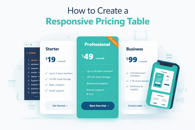
We’ve all been there. You’re building a landing page for a new service, a SaaS tool, or even a freelance portfolio, and you hit that wall . the pricing section.
It’s the second most important part of your site (after the hero section), but making it look good on both a 4K monitor and a tiny iPhone? That’s where things get messy. Tables break, cards overlap, and suddenly your “simple” design turns into a CSS nightmare.
That’s exactly why I sat down last week and built the FlexPricing script you see floating around. And no, it’s not just another Bootstrap clone. It’s a lightweight, human friendly, responsive pricing table that actually respects your time.
The Problem with Most Pricing Scripts
Most pricing tables out there are either ancient (relying on rigid grid frameworks that collapse under pressure) or overly complicated (packed with JavaScript just to change a color). I wanted something that works right out of the box. I didn’t want to fight with floats or strange margin hacks.
So, I opened my code editor, grabbed a cup of coffee, and built a system using pure Flexbox. The result? A script that feels like a first-class citizen on any device.
What Makes This Script Different?
Let’s walk through the highlights. When you look at the index.html structure, you’ll notice I kept it semantic. No div soup here. The .pricing-grid is the heart—it uses display: flex with flex-wrap: wrap.
This means:
- On a desktop: Three beautiful cards sit side-by-side, breathing evenly.
- On a tablet: The cards shrink gracefully or wrap naturally without leaving awkward white space.
- On a mobile phone: The cards stack vertically, filling 100% of the width. No horizontal scrolling. No squished text.
I also added a subtle human touch: the “Most Popular” badge. Instead of a boring corner tag that falls off on mobile, I used a dynamic rotated ribbon. It draws the eye exactly where you want it to your highest-converting plan.
The Little Details (That Actually Matter)
You’ll notice in the main.css file that I didn’t just throw #000 and #fff around. I chose a soft, modern palette: #F3F7FA for the background (easier on the eyes than pure white), and #1e4a76 for the primary buttons. It feels trustworthy, not salesy.
The icons are inline SVGs. Why? Because loading external icon fonts for a pricing table adds HTTP requests. These icons are baked right into the HTML. They load instantly, look crisp on Retina screens, and use a friendly green checkmark (#2b9348) that subconsciously says “Go ahead, pick this plan.”
I also spent time on the hover effect. A simple transform: translateY(-8px) with a shadow change. It gives the card a little “lift” when the user mouses over it, offering tactile feedback without being dramatic.
How You Can Customize It (The “DzCoding” Way)
Since this is for my site (dzcoding.com), I built this to be a “grab and go” tool. But customization is easy.
- Changing Colors: Open
main.cssand find the:rootor the.btn-primaryclass. Change the hex values, and the whole vibe shifts from blue to green, purple, or whatever your brand uses. - Adding a Toggle (Yearly/Monthly): The script is static right now, but because the pricing is in a clean
.pricewrapper, adding a JavaScript toggle is a 5-minute job. - Changing Features: Just update the
<ul class="features">list. Add a line, remove a line. The Flexbox handles the height automatically so all cards stay equal in length (no annoying uneven bottoms!).
Final Thoughts
If you are building a startup landing page, a digital agency site, or even a portfolio for your dev services, don’t reinvent the wheel. This responsive pricing table HTML/CSS script is ready to use. It’s lightweight (less than 5KB of CSS), responsive, and built to convert.
Feel free to rip the code from above, tweak the copy, and make it yours. And if you do something cool with it, drop a comment below I’d love to see how you bend it to your will.
Happy coding, everyone .