Web design trends usually feel like a race to see who can frustrate users the fastest. Remember the early 2000s auto-play music? Or the “hover to reveal navigation” nightmare of 2015?
But 2026 is different. This year, the trends aren’t about showing off what CSS can do. They’re about human connection.
For coding learners like you, this is great news. Search engines (especially Google) now reward sites that keep people reading, clicking, and staying. That means your code needs to serve the user first. In this guide, I’ll walk through 10 trends that blend modern design with practical SEO wins. No fluff. No “synergy.” Just clear, actionable patterns you can start testing today.
1. Brutalism (Raw, But Readable)
Brutalism raw, unpolished layouts with visible borders and system fonts has been around for years. But in 2026, it’s evolving. The trend is humanized brutalism: intentionally simple design that feels like a handwritten note, not a broken website.
Coding tip: Use system fonts (like -apple-system, BlinkMacSystemFont) instead of loading custom fonts. Faster load time = better Core Web Vitals.
body {
  font-family: -apple-system, BlinkMacSystemFont, 'Segoe UI', sans-serif;
  line-height: 1.6;
  max-width: 700px;
  margin: 0 auto;
  padding: 2rem;
}That’s it. No frameworks required.
2. Scrollytelling (Narrative-Driven Scrolling)
Scrollytelling is where scrolling triggers animations, data visualizations, or text changes. Think The New York Times’ interactive features. For 2026, it’s becoming accessible to everyday developers thanks to the Intersection Observer API.
Real-world example: A coding tutorial that shows code output changing as you scroll down the explanation. Learners stay because they see immediate cause-and-effect.
Implementation approach: Don’t overcomplicate. Use a lightweight library like ScrollReveal or vanilla JavaScript with IntersectionObserver. Load animations only when the element enters the viewport.
3. Dark Mode as the Default (Not Just an Option)
In 2026, designing for light mode first is increasingly rare. More sites are launching with dark mode as the primary theme, especially for developer tools and documentation sites.
Coding strategy: Use CSS custom properties (variables) and prefers-color-scheme. Don’t build two separate sites detect the user’s system preference.
:root {
  --bg: #ffffff;
  --text: #111111;
}
@media (prefers-color-scheme: dark) {
  :root {
    --bg: #0a0a0a;
    --text: #e0e0e0;
  }
}
body { background: var(--bg); color: var(--text); }This keeps your code clean (no duplicate content issues).
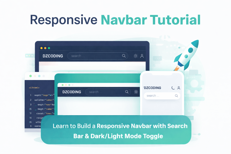
Example : Build a Responsive Navbar with Search Bar & Dark/Light Mode Toggle
4. Grain and Texture (Moving Away from “Flat Everything”)
The flat design era (think 2015 Bootstrap) is fading. In 2026, designers are adding subtle noise, grain, or paper like textures to backgrounds. It sounds counter-intuitive, but it actually makes text more readable by reducing contrast fatigue.
Caution: Use <canvas> or SVG noise, not heavy image files. A 0.5 KB SVG grain effect beats a 200 KB PNG. Keep that Lighthouse score green.
5. Conversational Copy & Interface Micro Copy
This isn’t just about design it’s about the words on the screen. In 2026, successful sites replace “Submit” with “Show me the results.” They replace “Error: Invalid input” with “Hmm, that email doesn’t look right. Want to try again?”
Example: A coding tutorial might say, “Stuck? Here’s what usually goes wrong” instead of “Debugging instructions follow.”
Actionable tip: Read your error messages and button labels out loud. If you sound like a robot, rewrite it.
6. Data Visualization First (Infographics Are Out, Interactive Is In)
Static infographics are losing ground to lightweight, interactive charts (using Chart.js, D3.js, or even pure CSS graphs). Learners don’t want to read a paragraph about browser usage statistics they want to hover and see the number change.
Real-world application: An article comparing CSS frameworks (Tailwind vs. Bootstrap) could feature an interactive bar chart showing bundle sizes. A learner can click “Show Tailwind” and see the data update.
SEO note: Wrap your chart in a <figure> element with a detailed <figcaption> containing the raw data. That way, Google indexes the information even if the chart fails to load.
7. Micro-Animations That Serve a Purpose (Not Decoration)
Many developers add hover effects just because they look cool. In 2026, the trend is functional micro-animations: a button that subtly expands on hover (confirming it’s clickable), a loading spinner with a progress percentage, a form field that shakes only if validation fails.
Golden rule: Keep animations under 300ms. Anything longer frustrates users. Use transform and opacity (not width or top properties) to trigger GPU acceleration.
8. Variable Fonts for Performance-Tuned Readability
Variable fonts are a single file that behaves like multiple fonts (weight, width, slant) without loading separate files. In 2026, they’re finally supported across all major browsers.
How to implement: Use @font-face with font-weight ranges. Fall back to system fonts while the variable font loads.
Audience win: Coding learners appreciate efficiency. Show them the font file size difference, and they’ll trust your expertise.
9. Privacy-First Design (No More Cookie Walls)
European regulations and growing consumer awareness are forcing a shift. In 2026, “privacy-first” means no tracking by default. It means explaining exactly what data you collect, right next to the input field.
Design trend: Place a subtle, dismissible privacy notice in a sidebar, not a full-screen modal. Use icons (an eye, a shield) to build trust instantly.
For coding learners: Implement a simple “local-only” analytics approach—track page views without external requests (using a backend you control). It’s better for performance and privacy.
10. The “Accessible UI” Overlay (Not as an Afterthought)
Accessibility (a11y) used to be a checklist. In 2026, it’s a design trend: visible focus indicators, high-contrast mode toggles, and “skip to content” links that are visible (not hidden until tab).
Example: A coding blog that includes a “reader mode” button that increases font size and line height. Non-disabled users love it too.
One line of code to start: Add :focus-visible styling to all interactive elements. Don’t remove the default outline unless you replace it with something more visible.
button:focus-visible, a:focus-visible {
  outline: 3px solid #ff8800;
  outline-offset: 2px;
}FAQs
Q: Do I need to implement all 10 trends at once?
No. Pick two or three that solve your biggest pain points. For a coding tutorial site, start with #1 (humanized brutalism) and #10 (accessibility). Then layer in #5 (conversational copy).
Q: Will following trends hurt my existing SEO rankings?
Only if you slow down your site. Always test your Core Web Vitals (Largest Contentful Paint, First Input Delay, Cumulative Layout Shift) before and after changes. Use Google’s PageSpeed Insights.
Q: How do I know if a trend is just a fad?
Ask: “Does this help the user complete a task faster or understand something better?” If yes, it’s a keeper. If it’s purely decorative (like 3D glasses cursors), skip it.
Q: I’m a beginner coder. Where should I start?
Start with semantic HTML and clean CSS. Trends come and go, but a well-structured <article> with clear headings and alt text on images will outrank 90% of fancy but broken designs.
Conclusion: Write Code for Humans, Optimize for Bots
The 10 trends above share one common thread they respect the user’s time, eyes, and intelligence. Humanized brutalism removes distractions. Scrollytelling respects attention spans. Privacy-first design respects autonomy.
For coding learners, this is liberating. You don’t need a $10,000 design system. You need empathy and clean code. Start with one trend this week. Refactor one page. Measure your bounce rate. Then keep going.
Happy coding