
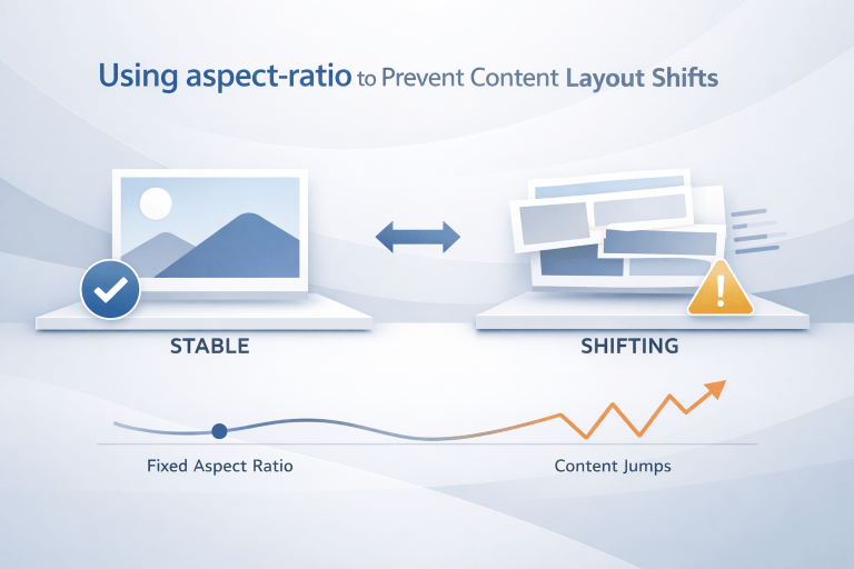
You’ve been there. You’re settled in, coffee in hand, reading a fascinating article. You click a link, and just as you lean in to read the headline BOOM. The page jumps. The image you were about to click vanishes downward, and you’ve accidentally clicked a banner ad instead.
That stomach lurching moment isn’t just an annoyance. It’s a conversion killer, an SEO downgrade, and a fast track to frustrated users hitting the back button. The culprit? Content layout shifts, specifically when images or embedded media load without reserved space.
But there’s a superhero property in modern CSS that fixes this elegantly aspect-ratio. And no, you don’t need a JavaScript heavy solution or complex responsive hacks anymore.
Let’s dive into why layout shifts happen, how aspect-ratio offers a silky smooth fix, and how you can implement it today to create a rock-solid, user-friendly web experience.
The “Jank” Nightmare: Why Your Content Is Dancing
Before we celebrate the solution, let’s empathize with the problem. The Cumulative Layout Shift (CLS) metric part of Google’s Core Web Vitals measures visual stability. A bad CLS score means your page elements (images, videos, iframes, ads) physically move after the page has rendered.
Imagine a news website. The HTML loads first, but the browser doesn’t know the dimensions of a hero image until the CSS and image file arrive. The browser reserves zero space for that image. Then, 800 milliseconds later, the image pops in. Suddenly, it’s 400 pixels tall. That pushes the headline, the “Read More” button, and three ads down by 400 pixels. Right when the user was about to click.
This is the unstyled content shift, and it’s a universal web headache.
The old, painful fix: Wrapping every image in a padding-top hack based on percentage (the “padding-bottom” method). It worked, but it was cryptic, brittle, and felt like duct-taping a leaky pipe.
The new, beautiful fix: CSS aspect-ratio.
What Exactly Is aspect-ratio? (And Why Browsers Love It)
The aspect-ratio CSS property is exactly what it sounds like: a way to declare the proportional relationship between an element’s width and height. You give it a ratio like 16/9, 4/3, 1/1 (a perfect square), or 2/1, and the browser locks those proportions.
Here’s the magic: you can set the width to 100% (of its container), and the browser automatically calculates the height based on that ratio. Or vice versa.
.responsive-image {
  width: 100%;
  aspect-ratio: 16 / 9;
}That single declaration tells the browser: “Reserve a space that is always 16 units wide for every 9 units tall, no matter what.”
When the browser parses your HTML, it sees that aspect-ratio rule, instantly allocates the correct height for the image box, and paints the rest of the page content around it. Then, when the actual image file (which also happens to be 16:9) loads, it slides perfectly into that pre-reserved slot. Zero shift. Zero surprise.
A Real-World Example: Hero Images No Longer Terrorize Your Text
Let’s compare the old way and the new way with a concrete scenario: a blog post with a hero image followed by a title and a call-to-action button.
Without aspect-ratio (The Shifty Nightmare)
<div class="hero">
  <img src="mountain-sunset.jpg" alt="Mountain sunset">
  <h1>10 Hiking Trails You Must Visit</h1>
  <button>Read Guide</button>
</div>No height or width attributes. No aspect-ratio. The browser sees the <img> tag, says “I don’t know how tall this is yet,” and reserves 0px. It renders the <h1> and button right under the top of the page. Then, mountain-sunset.jpg loads (say, 1200x675px). Suddenly, the <h1> and button jump down 675px. The user who was aiming for the button just clicked into the wilderness.
With aspect-ratio (The Smooth Professional)
.hero img {
  width: 100%;
  aspect-ratio: 1200 / 675; /* Or simply 16 / 9 */
  object-fit: cover; /* Ensures the image fills the space nicely */
}Now, the instant the HTML loads, the browser carves out a perfect 16:9 rectangle at full width. The <h1> and button are placed below that reserved space from the very first render. When the photo arrives, it slots in without moving a single letter. The user experience is buttery smooth, and Google’s CLS score drops to near zero.
The Cascade of Benefits: Beyond Just Stopping Jumps
aspect-ratio isn’t just a CLS band-aid. It’s an upgrade to your entire design system.
1. It Makes Responsive Design Effortless
You no longer need media queries to adjust image heights. An image with aspect-ratio: 4/3 and width: 100% will shrink and grow gracefully from a 320px mobile screen to a 4K monitor. The ratio stays consistent, so your grid alignment never breaks.
2. Placeholders Become Beautiful (Not Blank)
Instead of showing a blank gray box or a loading spinner, you can style the empty aspect-ratio container with a subtle background color, a gradient skeleton screen, or even a low-resolution blur. Users get a sense of what’s coming, reducing perceived loading time.
.hero img {
  width: 100%;
  aspect-ratio: 16/9;
  background: #f0f0f0;
  background-image: repeating-linear-gradient(45deg, #ddd 0px, #ddd 2px, transparent 2px, transparent 6px);
}3. It Works for Videos, Iframes, and Cards Too
You’re not limited to <img> tags. Embedded YouTube videos, tweets, Instagram posts, and even generic <div> cards can benefit.
.video-wrapper iframe {
  width: 100%;
  aspect-ratio: 16 / 9;
}No more crazy position: relative + padding-bottom: 56.25% hacks. Just clean, readable CSS.
How to Integrate aspect-ratio Without Breaking Existing Layouts
Transitioning to aspect-ratio is surprisingly low-risk, but there are three crucial considerations to keep in mind.
1. Always Pair with object-fit for Images
By default, an image inside an aspect-ratio box will stretch or squash to fill that box. That can distort your gorgeous photography. Use object-fit: cover; to crop the image elegantly, or object-fit: contain; to letterbox it.
img {
  width: 100%;
  aspect-ratio: 4/3;
  object-fit: cover;
}2. Respect Natural Dimensions When Possible
If you already set width and height attributes in your HTML (e.g., <img width="800" height="600">), modern browsers will automatically compute the aspect ratio from those attributes. That’s called intrinsic aspect ratio. So you can keep your existing markup and simply add width:100%; height:auto; in CSS—the aspect-ratio property isn’t always necessary, but it gives you explicit control.
3. Handle Edge Cases for Very Small Screens
On extremely narrow viewports, an element with a very wide ratio (like 21/9) might become too short in height to read any internal text. Consider using media queries to adjust the ratio for critical content blocks:
.card {
  aspect-ratio: 1 / 1;
}

@media (max-width: 480px) {
  .card {
    aspect-ratio: 2 / 1;
  }
}Real-World SEO and User Experience Impact
Let’s talk about what matters to you as a strategist: numbers and retention.
- Google’s Core Web Vitals: Since May 2021, CLS has been a ranking factor. Sites with low CLS (below 0.1) are favored in search results. Implementing
aspect-ratioacross your images and embeds directly improves your CLS score. - User Trust: A non-janky interface signals professionalism. On e-commerce sites, layout shifts during product image loading have been shown to increase accidental clicks and decrease add-to-cart rates. Stability equals trust.
- Accessibility: Screen readers and users with motor impairments rely on predictable interfaces. When a button moves just as they’re about to activate it, you’ve created a barrier.
aspect-ratioremoves that barrier.
The Migration Checklist: From Shifts to Stability
Ready to roll out aspect-ratio across your site? Here’s a simple, phased approach.
- Audit high-CLS pages using Google PageSpeed Insights or Lighthouse. Identify images and iframes without explicit dimensions.
- Add base styles globally:
img, iframe, video, [data-aspect-ratio] { max-width: 100%; aspect-ratio: attr(width) / attr(height); }(Note: theattr()function is evolving; safer to manually set). - Target problem components first: hero images, article thumbnails, embedded tweets, and lazy-loaded gallery items.
- Test on mobile devices using real networks (throttle to 3G). Watch for any unexpected overflow or overlapping text.
- Monitor your CLS in Google Search Console over 28 days. You should see a measurable drop.
A Note on Browser Support (It’s Excellent)
As of now, aspect-ratio is supported in all modern browsers: Chrome, Edge, Firefox, Safari (from version 15), and Opera. That’s over 92% of global web traffic. For the remaining older browsers (looking at you, legacy Android and IE11), the fallback is simple: they’ll ignore aspect-ratio and revert to the old behavior (image loads at natural size, causing a shift). To soften that, you can use the @supports rule:
@supports not (aspect-ratio: 1/1) {
  /* Provide a fallback, like a fixed height or padding hack */
  .image-container {
    min-height: 200px;
  }
}But realistically, by now, most of your users will benefit from the native property.
Putting It All Together: A Future-Proof Content Strategy
Resisting content layout shifts isn’t just a developer’s chore it’s a content strategist’s competitive advantage. When your articles, product pages, or dashboards load with rock solid stability, you communicate reliability before a user reads a single word.
The aspect-ratio property is the simplest, most elegant solution to a problem that has haunted the web for two decades. It replaces CSS hacks with a single line of logic. It aligns perfectly with Core Web Vitals. And it makes your users’ day just a little less frustrating.
So go ahead. Audit your images. Add aspect-ratio: 16/9 (or whatever ratio fits your brand). Watch the jank disappear. And take a quiet victory lap the next time you check your Lighthouse score.
Your users and their cursors will thank you.